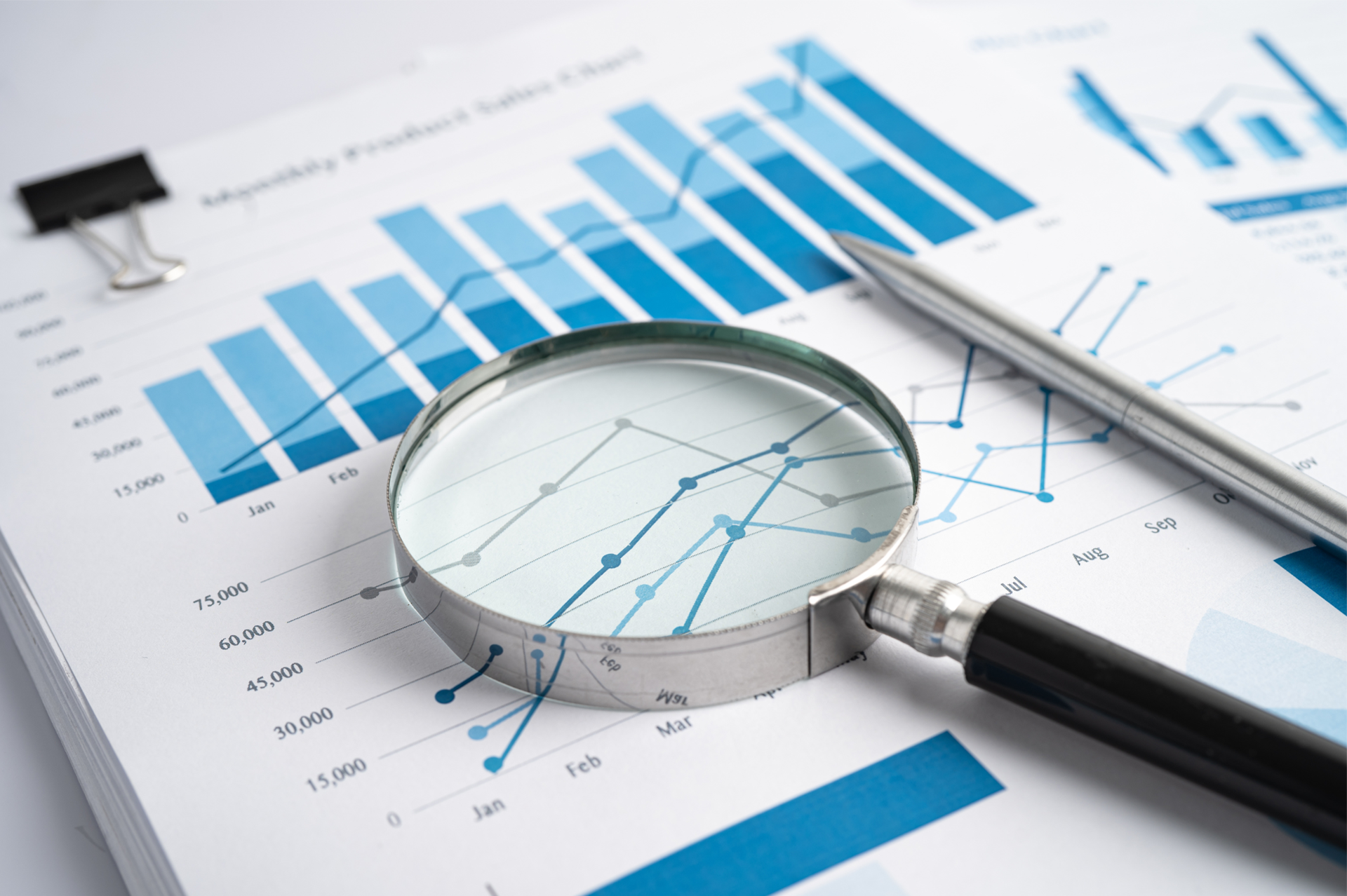
Sales Dashboard
Roger Knocker • November 30, 2023
Business is great when Sales are great.
A sales dashboard provides you with the visibility and control from the time a quotation is made until goods and services are delivered to the customer. Data for All the information for this module comes from the Sales Module within the ERP.
We provide you with KPIs and measures sufficient to be successful at selling profitably. This includes:
As a starting point (in addition to the right KPIs and measures) you need proper comparisons in place to start a meaningful sales analysis. Our dashboards ensure that you can compare:
In order to know or not if your customers are being services adequately, we ensure that you have a few service delivery KPIs on the dashboard. In manufacturing and logistics On Time and in Full (%OTIF) is often a useful measure to use as it tracks the actual delivery against the customer’s expectation at an operational level. In order for this to be meaningful, your underlying processes must track:
Sales and delivery is very important, but most customers expect you deliver inside a quality tolerance whether they explicitly tell you about it or not.
A crude way of measuring quality on the dashboard is to track the credit notes:
In some industries you can make the sale if you can deliver at quality but in an acceptable time frame.
Many customers are not world class at planning with you and you’ll probably find that they want goods and services yesterday.
A good sales dashboard will track “order lead time” sufficient to outperform your competitors in terms of important customers, products and markets
Sales growth generally is the most effective way to boost net profit. We all know that mining your existing customers is far more lucrative than finding new ones but at some stage it will be necessary to find new clients once your current customer growth has reached saturation point.
Using the comparisons discussed above, we help you track growth using the following metrics:
Lost customers usually have the most negative impact on growth, if nothing else because of the cost, lost time and effort needed to regain or replace a customer.
It’s useful to be able to identify items that are being neglected by the sales team or are coming to the end of their life cycle
Our sales dashboard picks up customer inactivity. This is most easily identified when supported with a robust sales forecasting process.
The key measures for this are:
Sales Analysis
As a starting point (in addition to the right KPIs and measures) you need proper comparisons in place to start a meaningful sales analysis. Our dashboards ensure that you can compare:
- Actual Sales to Budget
- Actual Sales to Last Month
- Actual Sales to the same period last year
- Month to Date
- Year to Date
- Actual to Forecast
- Trend information
- Past Months
- Past Years
- Rep vs Rep
- Other comparisons
- Product A vs Product B
- Region A vs Region B
- Customer A vs Customer B
Service Delivery
In order to know or not if your customers are being services adequately, we ensure that you have a few service delivery KPIs on the dashboard. In manufacturing and logistics On Time and in Full (%OTIF) is often a useful measure to use as it tracks the actual delivery against the customer’s expectation at an operational level. In order for this to be meaningful, your underlying processes must track:
- Requested Date
- Confirmed Date
- Date delivered – ideally with some sort of Proof of Delivery
- Your process and systems should be dynamic enough to handle changes to the expected date of delivery made by the customer (with reasons) as well as internal changes
Quality
Sales and delivery is very important, but most customers expect you deliver inside a quality tolerance whether they explicitly tell you about it or not.
A crude way of measuring quality on the dashboard is to track the credit notes:
- # of Credit Notes – will tell you how many times a quality issue is raised by the customer
- Value of Credit Notes – will inform you about the magnitude of the problem
- % Credit Notes to Sales is a neat way to ensure that the KPI is improving overtime after taking into account seasonality or changes in sales volume.
Lead Time
In some industries you can make the sale if you can deliver at quality but in an acceptable time frame.
Many customers are not world class at planning with you and you’ll probably find that they want goods and services yesterday.
A good sales dashboard will track “order lead time” sufficient to outperform your competitors in terms of important customers, products and markets
Revenue Growth
Sales growth generally is the most effective way to boost net profit. We all know that mining your existing customers is far more lucrative than finding new ones but at some stage it will be necessary to find new clients once your current customer growth has reached saturation point.
Using the comparisons discussed above, we help you track growth using the following metrics:
- Sales Growth per Region.
- Sales Growth per Product / Service
- Sales Growth per Market
- Sales growth per Rep
Lost Customers and inactive Products/Services
Lost customers usually have the most negative impact on growth, if nothing else because of the cost, lost time and effort needed to regain or replace a customer.
It’s useful to be able to identify items that are being neglected by the sales team or are coming to the end of their life cycle
Our sales dashboard picks up customer inactivity. This is most easily identified when supported with a robust sales forecasting process.
The key measures for this are:
- Sales vs Forecasted Sales
- Sales vs Prior Period Sales
- Estimated Value of Inactive Items (Last 6 Months)
- # of Inactive Items (Last 6 Months)

What one construction disaster taught us about process and why every business needs a CAiSY blueprint.
In the world of finance, numbers tell a story. However, that story is often buried beneath layers of spreadsheets and complex datasets. For financial professionals, the challenge is not just about understanding these numbers but also presenting them in a way that drives decision-making and inspires action. Enter data visualisation – the art of transforming data into clear, compelling visuals. Among the tools that have proven especially powerful are the line graph and the waterfall chart. These visuals help finance teams translate dry statistics into impactful narratives. In this article, we explore how these graphs can transform financial storytelling. The Importance of Data Visualisation in Finance Finance professionals are accustomed to handling vast amounts of data, from profit margins and revenue growth to expense tracking and risk assessments. Yet, presenting these figures effectively to stakeholders is a different ballgame. Visualisation simplifies this process, turning complex data sets into accessible insights. When done correctly, data visualisation: Enhances comprehension: Humans process visuals 60,000 times faster than text, making it easier for stakeholders to grasp key information quickly. Drives decision-making: Clear and compelling visuals help executives make informed decisions without wading through dense reports. Highlights trends and outliers: Visual tools can bring hidden trends and anomalies to light, prompting timely actions. Improves understanding and communication with business - Business doesn't always get what Finance is trying to communicate and good visualisations go a long way to bridging the gap. Better communication improves alignment to strategic financial goals. The line Graph: Unravelling Trends Over Time The line graph, also known as a stream graph or a stacked area graph, is a powerful tool for visualising changes in data over time. It is especially effective in showing how multiple categories contribute to an overall trend. In finance, line graphs can illustrate revenue streams, expense categories, or investment performance in a visually engaging manner. Use Case: Revenue Streams Analysis Imagine a financial report for a company with diverse revenue streams, such as product sales, services, and subscriptions. A line graph can display how each stream has evolved, highlighting peaks and troughs. The thickness of each ‘line’ represents the contribution of that revenue stream to the total, making it easy to spot which areas drive growth. Benefits of line Graphs: Trends Made Simple: Displays how multiple components evolve over time. Visual Impact: The fluid, organic design makes it easier to follow changes. Comparative Insight: Helps compare different categories intuitively. The Waterfall Chart: Bridging the Gap Between Figures Waterfall charts excel at breaking down the cumulative effect of sequential data points, making them ideal for financial analysis. They help bridge the gap between figures by showing how individual elements contribute to a total. Commonly used in profit and loss statements, budget analysis, and variance reports, these charts provide clarity in understanding how specific actions impact the bottom line. Use Case: Profit and Loss Analysis A financial analyst preparing a quarterly report might use a waterfall chart to demonstrate how various factors—like increased sales, higher marketing spend, and cost savings—impacted net profit. The chart’s structure, with its clear progression from starting figures to the final result, makes it easy for stakeholders to follow the financial narrative. Benefits of Waterfall Charts: Clarity: Simplifies complex financial data by showing individual contributions to total figures. Transparency: Clearly distinguishes between positive and negative impacts. Decision Support: Helps executives understand the key drivers of financial performance. Choosing the Right Visual for the Right Data Selecting the appropriate visual tool depends on the story you want to tell: Use line graphs for illustrating trends across multiple categories over time. Opt for waterfall charts when you need to detail the step-by-step impact of specific factors on an overall financial figure. By mastering these tools, finance professionals can enhance their storytelling, transforming raw data into insights that drive strategic decisions. Conclusion: From Data to Decisions The ability to visualise data effectively is a powerful advantage. The line graph and waterfall chart are more than just visual aids—they are essential tools for financial professionals looking to make data-driven decisions that resonate with stakeholders. By adopting these techniques, finance teams can turn numbers into narratives that not only inform but also inspire action. In the end, the power of finance lies not just in analysing data but in presenting it with impact.